Why 7px Doesn’t Mean What You Think
Measurement is Everywhere
Measurement is everywhere. It’s an effort to quantify the attributes of an object or an event so that we can compare them. If I say I need a 1 cm wire, you know exactly how long to cut it because we have defined 1 cm.
Web Development and Dimension Challenges
As a web developer, you need to create websites. And while creating websites, you need to specify the dimensions of your elements. For example, I may want an image to be of a specific dimension. How to say that? A 5 cm wide image? Great! Say you created a 5 cm x 5 cm image on your website. I get home and try to access it on my laptop—it looks fine. Then, my battery dies, and I access it on my TV (75 inches). You know what’s gonna happen? It looks too small. I’m unhappy now. To make me happy, you need to find a fix for this.
A Simple Fix: Scaling Dimensions
A simple solution looks like this: we scale up our dimensions as the display gets bigger. So, 5 cm won’t actually be 5 cm. Let’s just drop cm then and introduce another unit called a pixel. When I say 5 px, it’ll vary across devices to account for consistency so that my elements look kinda similar. How to do that? We’ll get back to that, but let me first introduce you to pixels (hardware) so you don’t confuse yourself.
Understanding Pixels (Hardware)
We’ll just get a high-level understanding of this. Displays are made up of tiny square elements called pixels (picture elements). They’re arranged in a grid. For example, when we say that the resolution of this display is 1920 x 1080, it implies that it is a grid of picture elements with dimensions 1920 x 1080. Each pixel has three tiny lights (see the RGB model) inside and can produce different colors by mixing them.
The Problem with Raw Pixels
Now, when I say 5 px, I don’t really mean 5 actual pixel elements on your display. Why? Because each display has a different PPI (pixels per inch). Since the number of pixels in an inch varies, 5 px would also be different. So, we introduced our own unit called a pixel to measure things. It’s just some other unit.
Achieving Consistency with Visual Angle
Now, back to our question: how to make our elements look consistent? The solution is visual angle. You see how you can’t differentiate between the sizes of the sun and the moon from Earth? The angle they subtend on our eyes is roughly around 0.5 degrees, i.e., the same for both. Hence, we can’t really tell which is bigger or smaller. We’ll use the same approach here. We’ll find a comfortable visual angle for our eye and try to match that on other bigger or smaller screens.
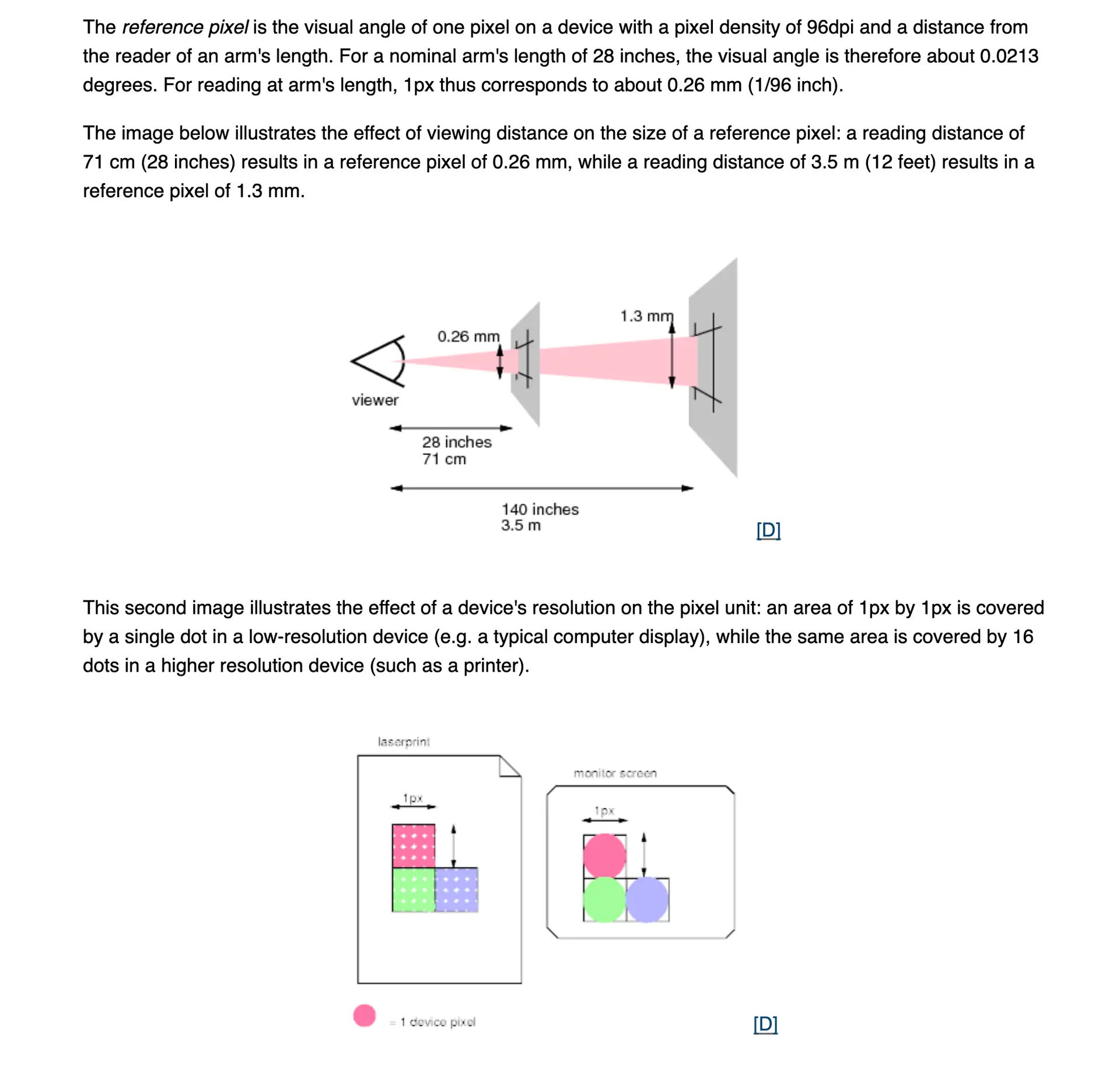
Introducing the Reference Pixel
Earlier, 96 DPI displays were very common. So, a reference pixel is defined based on them. We took a 96 DPI display, a viewing distance of around 71 cm, and found the visual angle. It came out to be 0.0213 degrees. We’ll try to get close to this on other devices. Say my visual angle is 0.01 degrees on some other display according to the optimal viewing distance, so we need to map 1 CSS pixel to 2 physical pixels (I assumed 2; you can calculate it yourself). The content of 1 CSS pixel will now be distributed across 4 physical pixels. Why 4? Because we are mapping a square pixel. How will you map a square pixel to a rectangular pixel? That’s why.
Browser Control and Scaling
Breaking news: you can’t control the scaling part. It’s controlled by the browser. To see the scaling applied on your device, run this command using JavaScript: window.devicePixelRatio